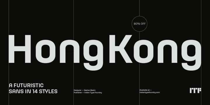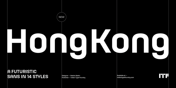
HongKong is a large, futuristic-style sans serif family. The letters have straight-sides even e and o, for example and the whole typeface has a rather minimalistic design.
Many typical sans serif features have been reduced somewhat. Quite a few lowercase letters are spurless. The a still has a double-storey structure, but it is without the final spur on its bottom right.
Other features of the fonts include a rounded-top A and a single-story g. HongKong includes 14 fonts. These are seven different weights, each with a companion italic. The italics are obliques. Like the upright fonts, all of their letterforms are drawn with mono-linear strokes. Each font includes alternate, even more-rounded versions of the letters M, N, V, W, X, Y, Z, v, w, x, y, and z plus all of the diacritic characters based on these.
HongKongs lowercase letters have a very tall x-height, and their ascenders rise above caps just a little bit.
The familys lighter weights feel nice and loose in text, while the heavier weights are spaced more tightly.
HongKong is a great font for the tech industry, but could also be put to good use to advertise music or art.

